Exploring New Horizons Outdoor Schools
Sector: Education
Services: Full identity & collateral design
Deliverables: Logo system | Basic brand rollout assets (print + digital)

The Brief
Exploring New Horizons is an outdoor education program serving more than 8,000 students across the San Francisco Bay Area and Central Coast. Its three campuses had developed largely independent identities, resulting in visual inconsistencies and a lack of cohesion across the organization.
Original logos:
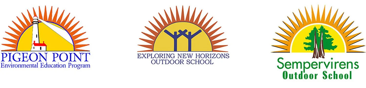
The brand overhaul required a delicate balance:
conceptualizing a new identity that honored the spirit of the original,
creating a unified visual system across all campuses, and
preserving the unique campus-specific awareness that staff and students had built over years of operation.
My Direction
To resolve the fragmentation between the three campuses, I focused on creating a modular brand architecture that could balance organizational unity with site-specific identity.
I reimagined the original sunburst as a “window” to nature—an invitation to curiosity and exploration. I paired it with a high-contrast palette of warm, bright colors and bold, playful typography to create a visual language that felt professional and welcoming, appropriate for students, parents, and donors.
The Result
Unified brand system: A tiered logo system that establishes a strong parent brand while preserving the unique silhouettes and "landmark" awareness of each individual campus.
Meaningful imagery: A new visual mark that serves as a "window" to the outdoors, reflecting the program’s mission to instill environmental literacy, stewardship, and team building in students.
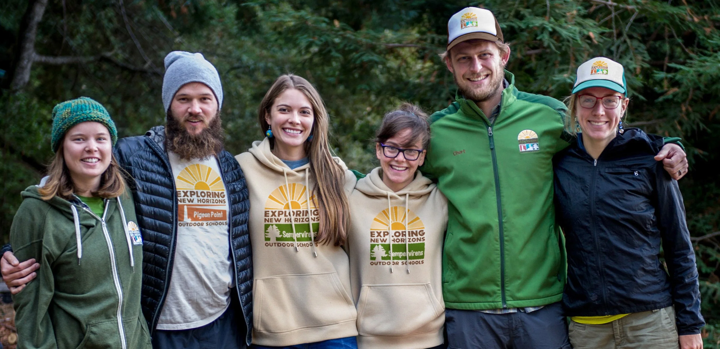
Flexible brand application: A streamlined design system built for versatile usage to reinforce brand power—from print annual reports and donor appeals to website, digital newsletters, and social campaigns.