Jones Coffee Roasters
Sector: Food & Beverage
Services: Brand refresh, brand stewardship, ongoing design
Deliverables: Brand guidelines | Campaigns | Print communications | Environmental graphics | Packaging
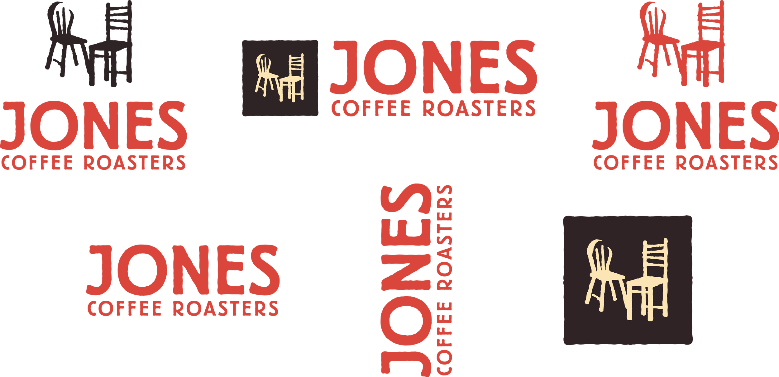


Original logo system:
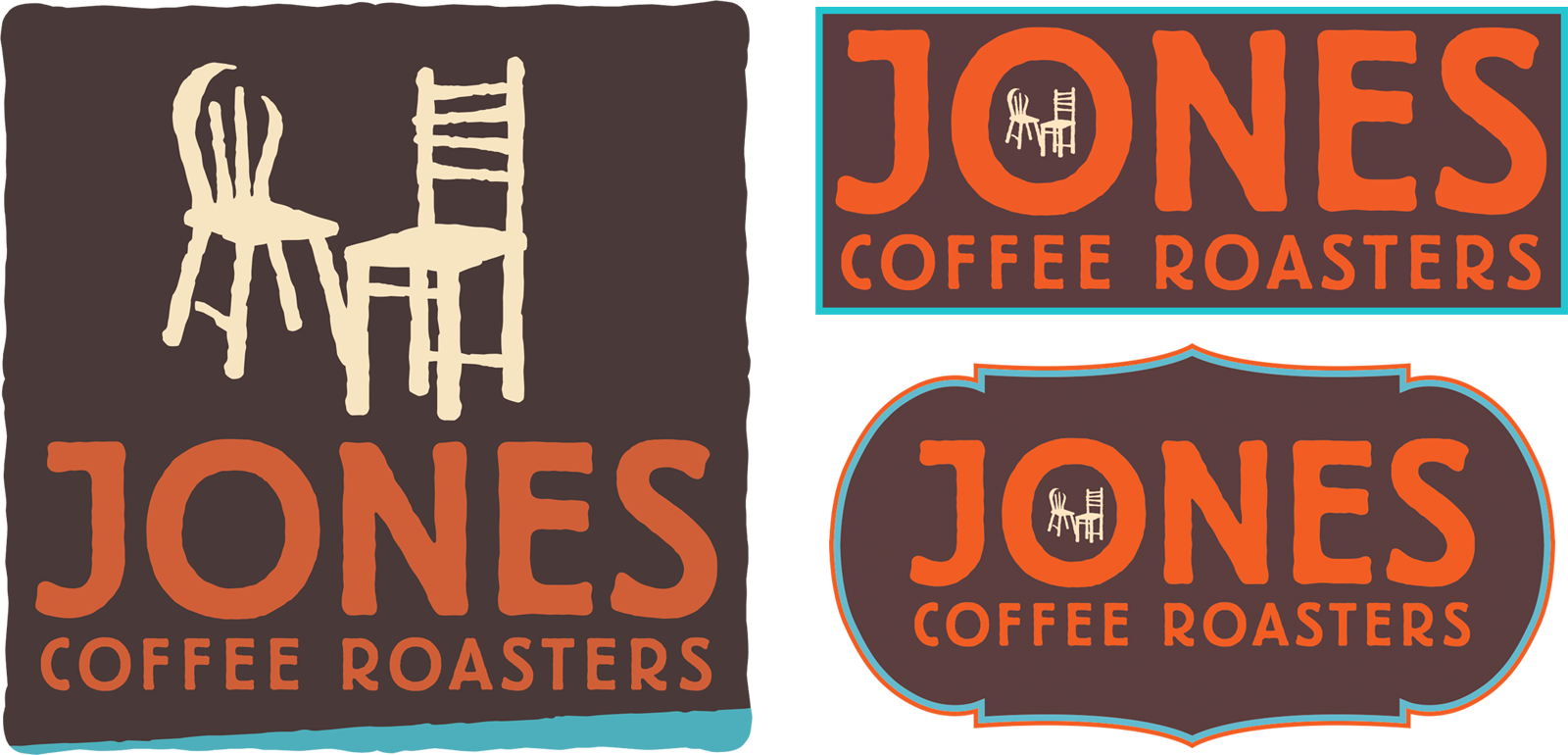
The opportunity was to preserve the character and equity of the existing brand while creating a more refined, contemporary system grounded in its history, values, and sense of place.
The Brief
Jones Coffee Roasters has deep roots in community and in the Jones family’s Guatemalan coffee-growing heritage. Its existing identity contained meaningful brand elements—most notably the mismatched “talking chairs,” which reference the company’s early days when customers brought their own chairs to gather at the café—but its visual system had not yet been fully developed to express the company’s story with clarity and intention.
Original logo system:
Opportunity was to prepare the character and equity of the existing brand while creating a more refined, contemporary system grounded in its history, values, and sense of place.
My Direction
I focused on highlighting what was already distinctive about Jones. I refined the logo system through more considered proportions, spacing, and hierarchy, and a more confident, contemporary presence while preserving the character of the original identity.
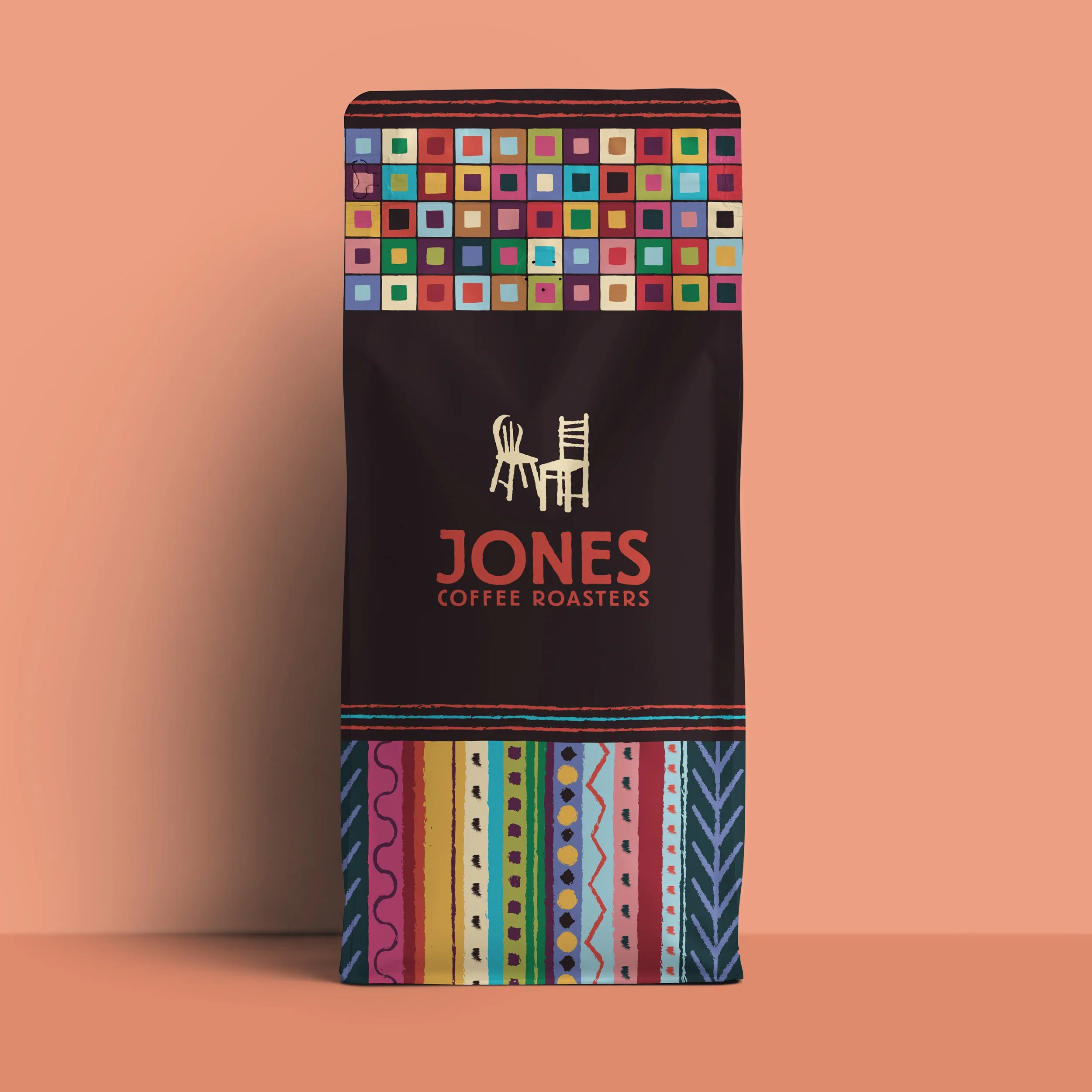
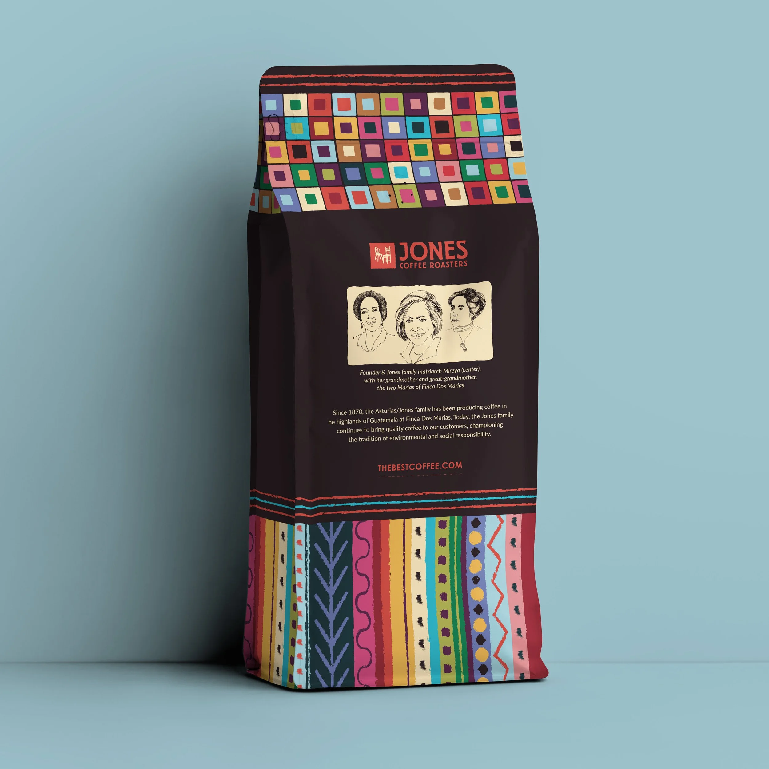
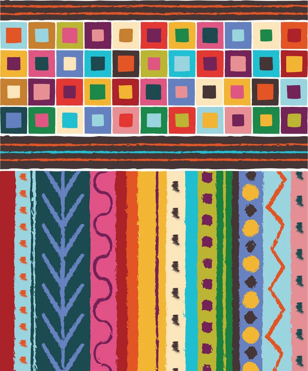
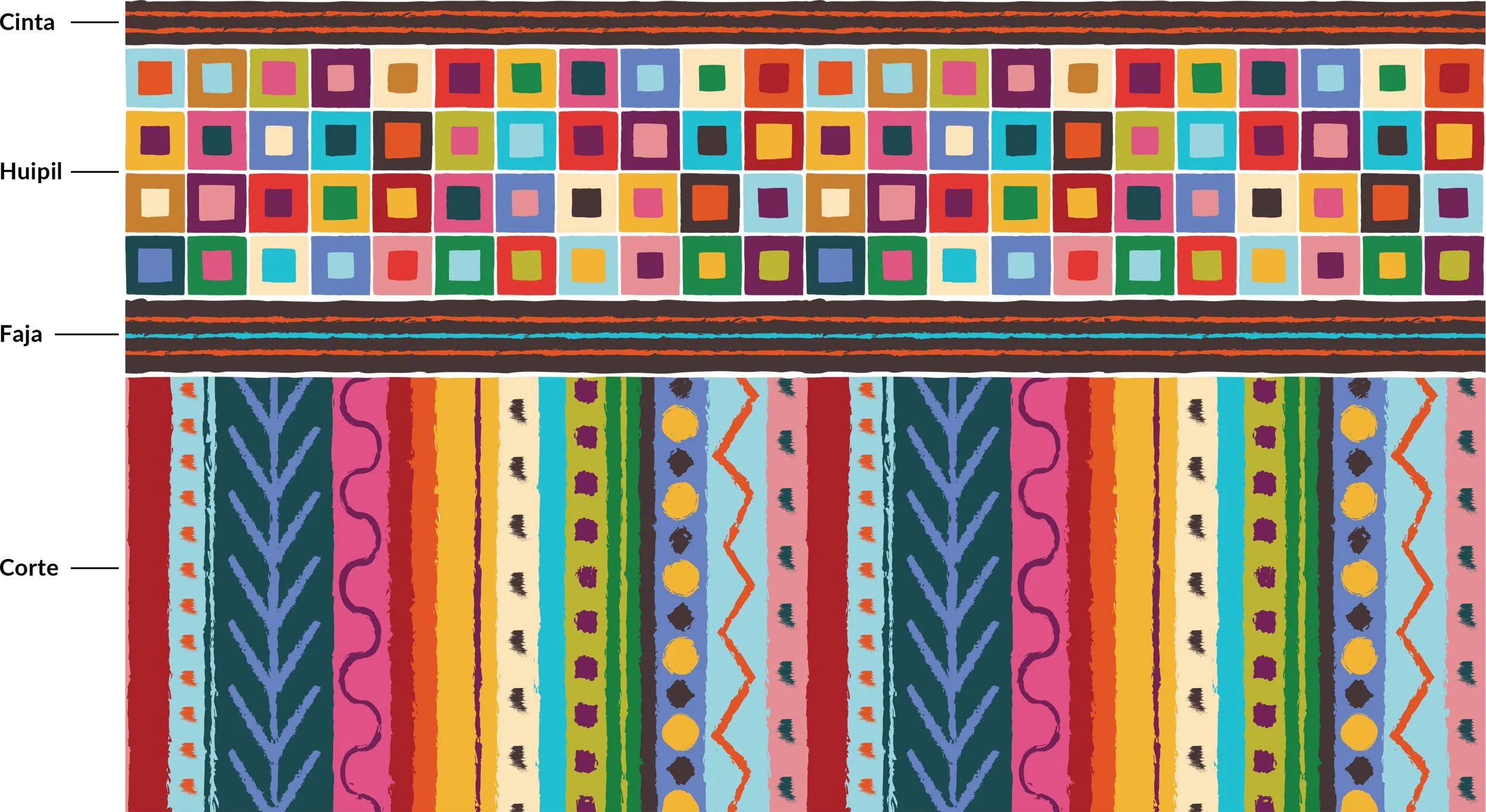
I then expanded the visual language through updated patterns and colors inspired by traditional Guatemalan dress, creating a more intentional connection to the family’s heritage and a flexible system for packaging, campaigns, retail environments, and everyday communications.
The Result
More meaningful identity: Key brand elements now connect more clearly to Jones’ story of community, hospitality, and heritage.
Greater visual clarity: Simplified logo lockups and more intentional hierarchy give the brand a more confident and impactful presence.
Flexible brand system: Expanded patterns, colors, and usage standards make the identity more adaptable across products, spaces, campaigns, and communications while maintaining cohesion.
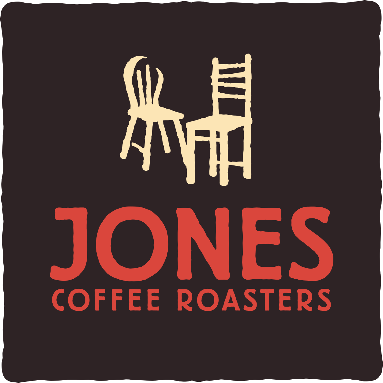
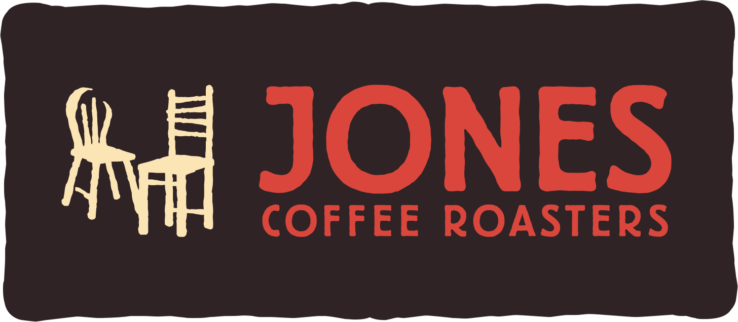
Logo LockupsAdjusted proportions, spacing, and hierarchy create greater breathing room and a more confident, contemporary presence.
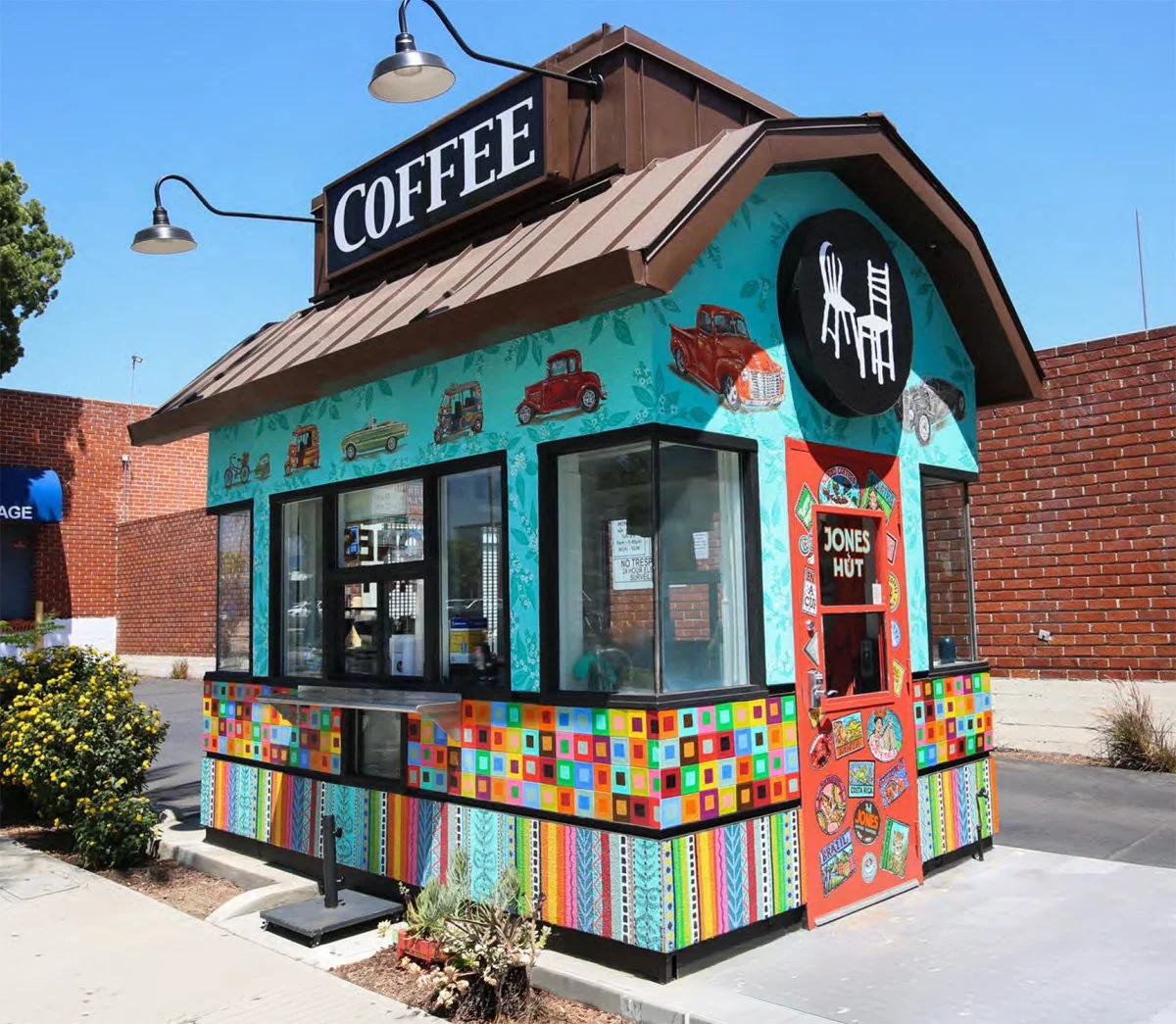
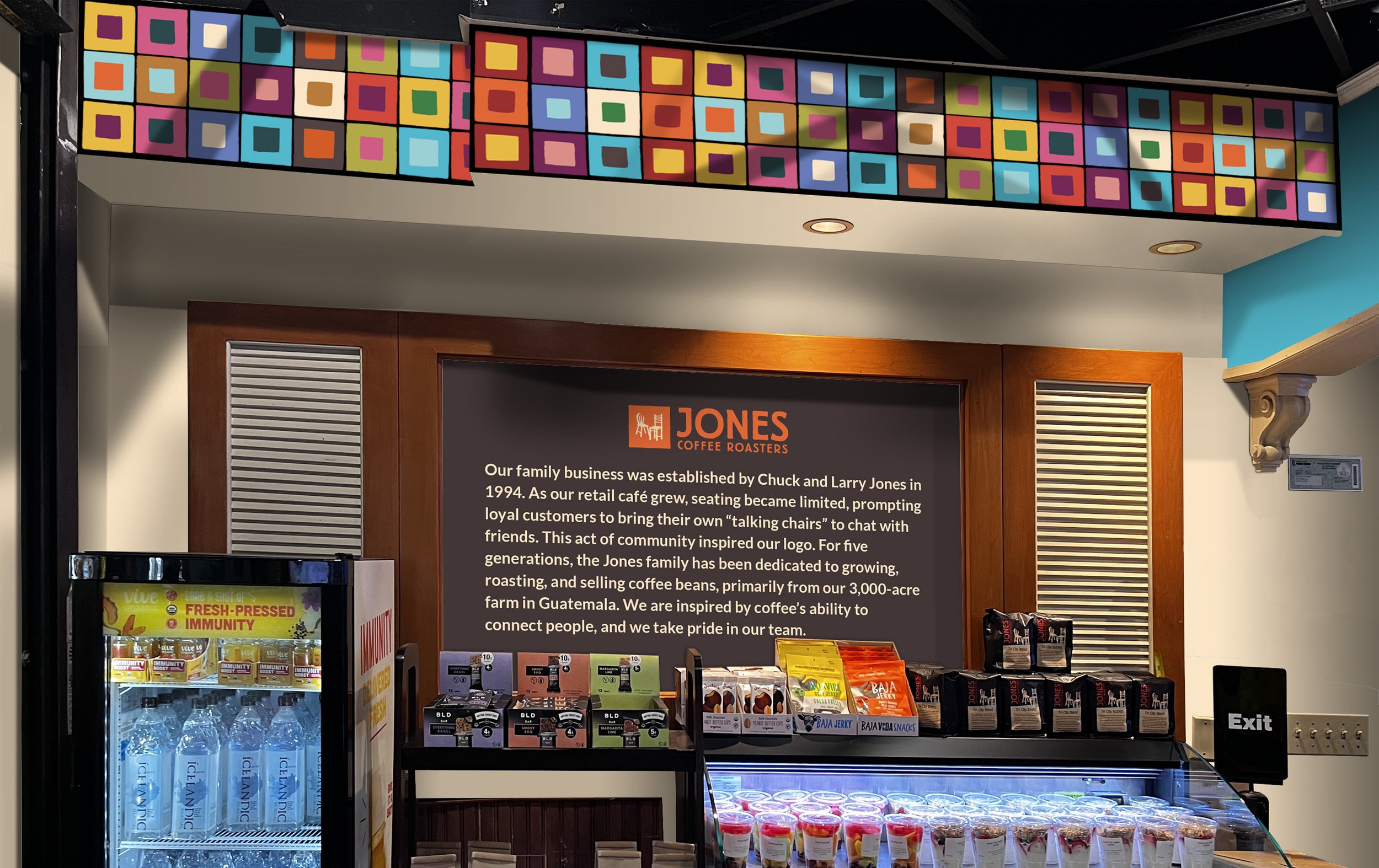
Pattern SystemPattern system inspired by traditional Guatemalan dress as well as artwork at the Jones drive-through.
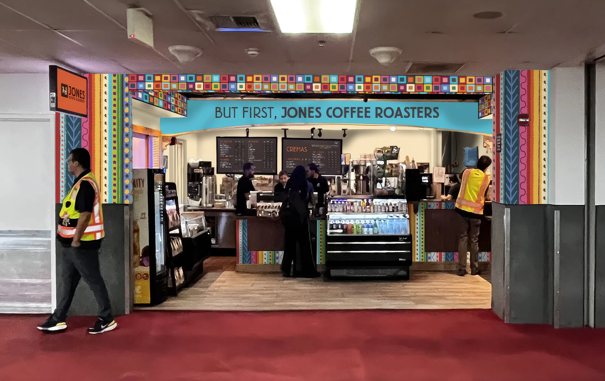
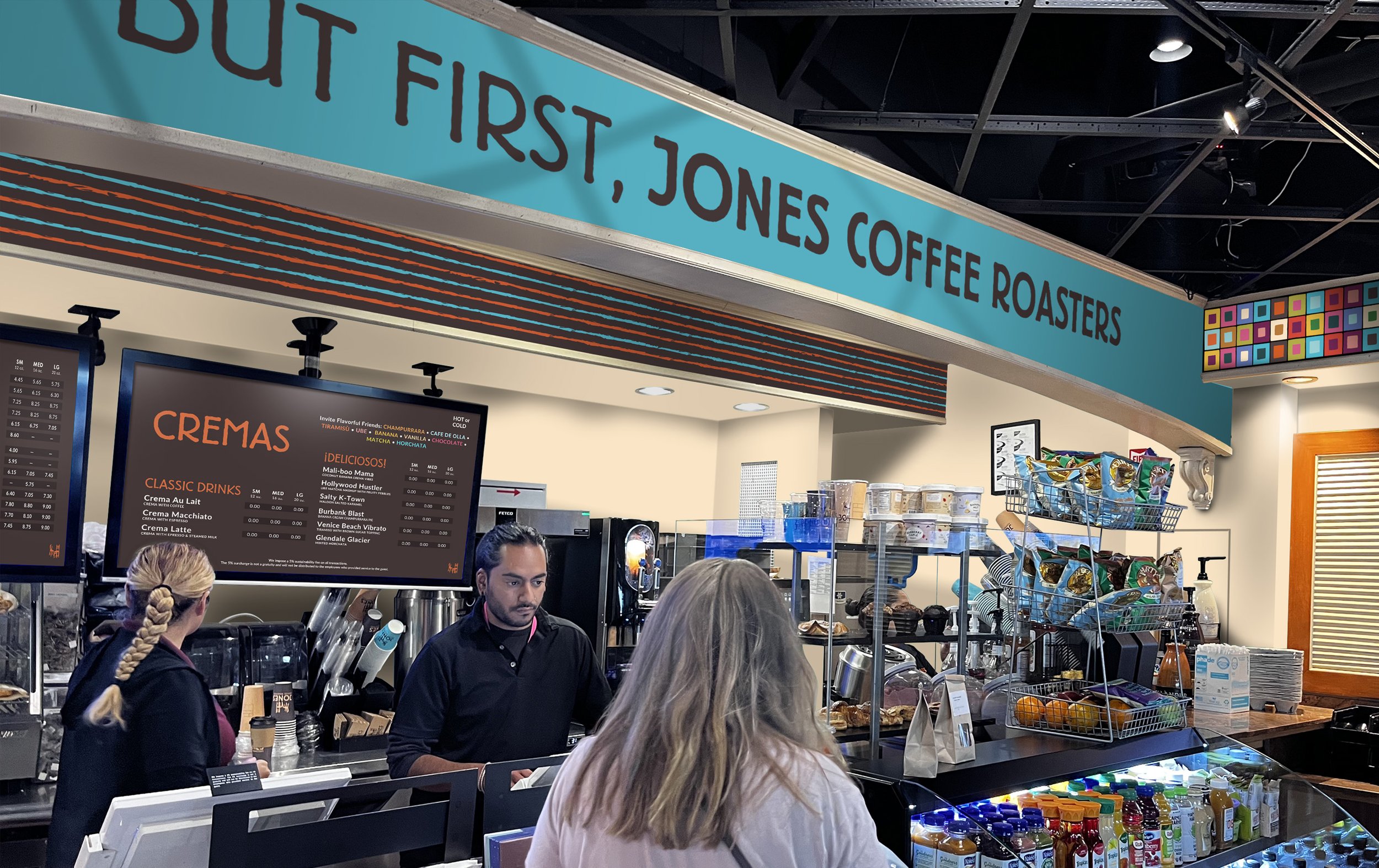
Retail EnvironmentSite-specific design for Jones’ Terminal A storefront, extending the brand across walls and architectural surfaces from client visualization through final production.
Coffee Bean Packaging